As a sheet runs through a printing press, being passed from unit to unit, it shifts. It doesn’t shift around much — in fact, the amount is barely even measurable, often just a fraction of a millimeter — but it does move, especially when flying through the press at high speed. This is simply a physical hurdle that must be compensated for when the art is being prepared. If this is not dealt with, the natural shifting in the press creates haloes and gaps where the unprinted stock peeks through.
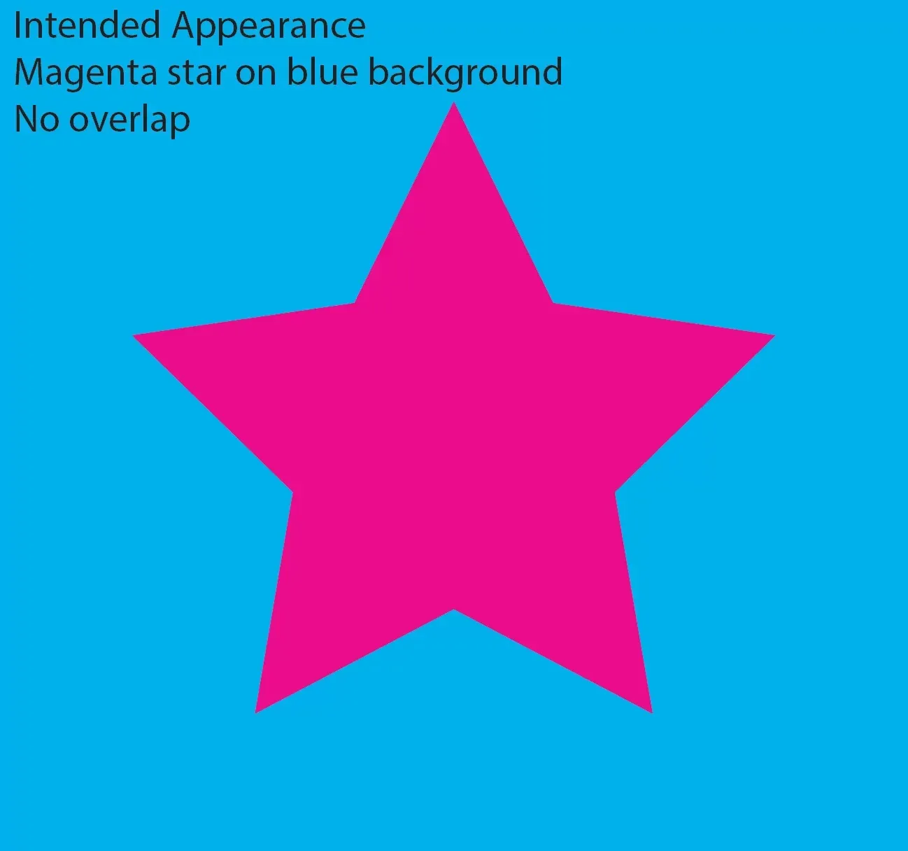
Intended appearance: magenta star on cyan background, no overlap.
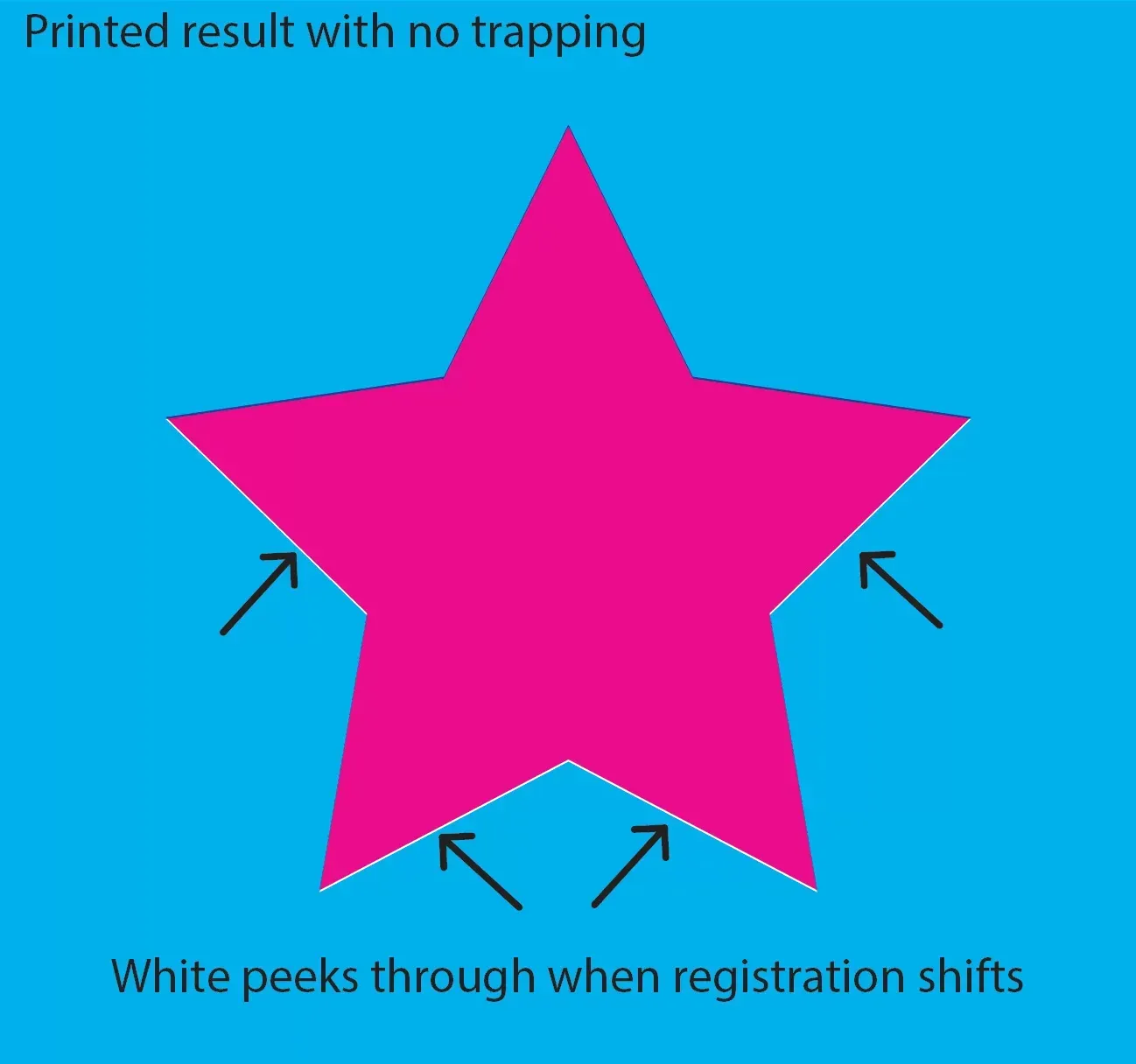
Printed result with no trapping. White peeks through when registration shifts.
Compensating for these shifts involves extending images and colors by a mere three thousandths of an inch (8 hundredths of a millimeter), an amount invisible to the naked eye. This microscopic overlap of color compensates for the shifting of the sheet, completing an illusion of two colors butting up to each other and appearing to touch without overlapping. That 0.003-inch overlap is called a trap.
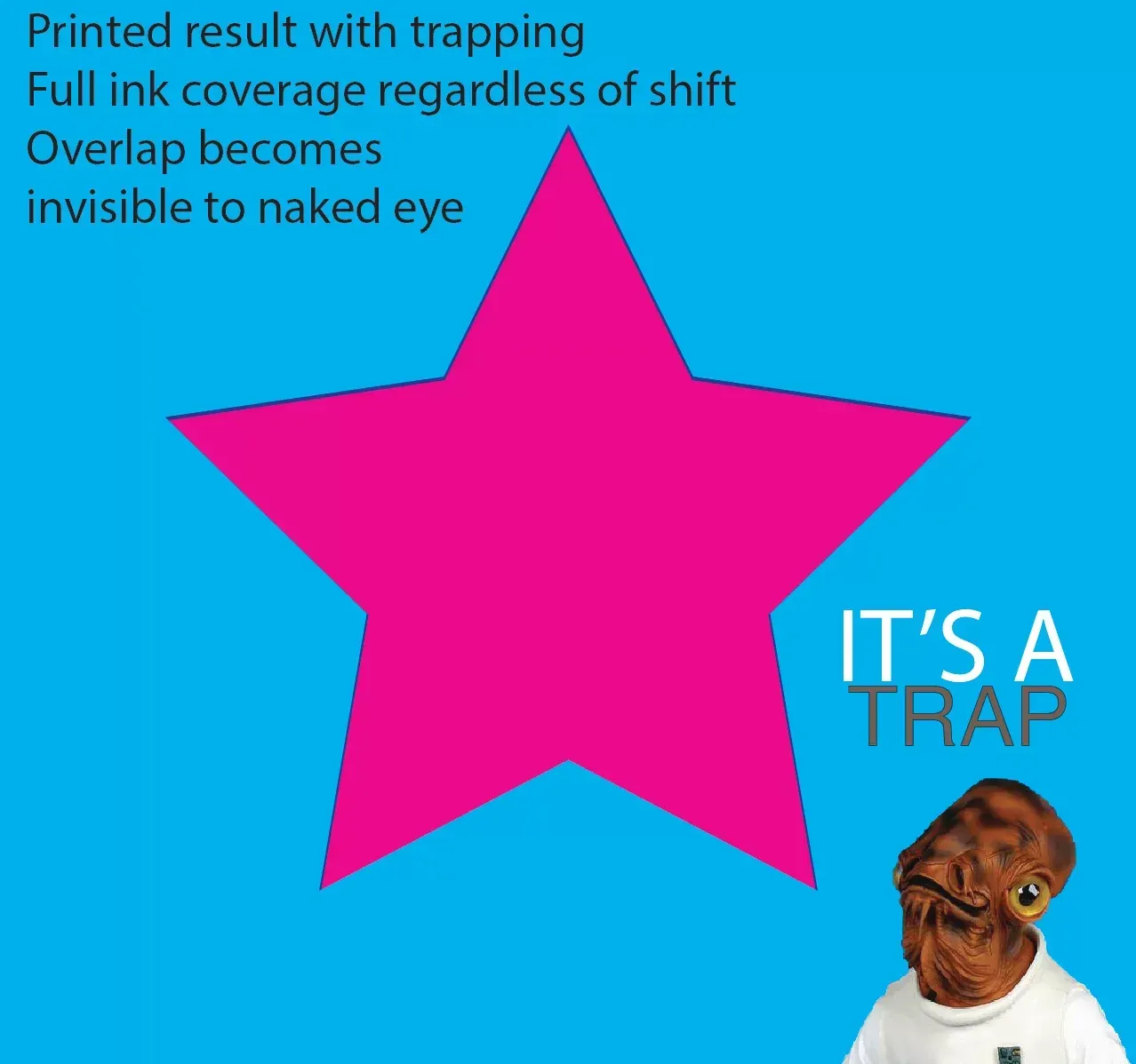
Printed result with trapping. Full ink coverage regardless of shift. Overlap becomes invisible to the naked eye.
As small as 0.003 inches may sound, however, it makes up the majority of the size of thin type — for example, legal fine print. Suppose that a paragraph of cyan fine print is placed on a yellow background. This would be a problem for a few reasons.

Intended appearance: cyan type on yellow background.
First, the trap (0.003 inches all around both sides of each letter) would make up the majority of the type, creating significant overlap of the cyan and yellow, thus making the type appear green. Whoops.

Appearance after attempting to trap. Yellow trapping into cyan makes all type appear green.
But a more common example is black type on a background.

Whether that background is a photo, a gradient, or a solid color, the problem ends up being the same. Fine print — in fact, most type — is ultimately too thin to trap. But now what? If the type can’t be trapped, the shifting of the sheet will produce haloes of white around the letters unless the black type falls exactly into the space left for it in all three of the other plates — which simply will not happen because the sheet will shift between print units. Here are the four images in such an example:

And a close-up of the (simulated) resulting sheet after running through the press:
White peeks through and magenta registration can be seen when the black type does not overprint.
Obviously, the “Launch Day” type is very large and thick lettering, and could easily be trapped if we wanted to. But for all black (and small) type, the solution is overprinting. Setting the black type to overprint means that the cyan, magenta, and yellow will not leave a space for the black. They will print their images normally, and the black type goes on top of it. The result?
Crisp, smooth type over a pleasant background. No peeking white, no registration issues.
These are just some of the nuts-and-bolts details that our prepress team obsesses over, day in and day out. We hope the next time you need quality, professional printing, you’ll allow us to take care of these details for you.

More Posts